
Content Analytics Dashboard: Metrics That Move the Needle
You're staring at Substack, Medium, LinkedIn, and X, trying to decide what deserves another life. One post has strong opens, another has impressive reach...
By Ian Kiprono
You're staring at Substack, Medium, LinkedIn, and X, trying to decide what deserves another life. One post has strong opens, another has impressive reach, and a third keeps attracting shares without producing obvious subscribers. The numbers don't agree, the platforms define engagement differently, and your spreadsheet is becoming a second job.
I've built and broken three versions of a cross-platform reporting system. The first counted everything. The second looked polished but didn't change what I published. The useful version answered one Monday-morning question: which piece should I adapt, schedule, or retire next? A content analytics dashboard earns its place only when it turns scattered activity into a clear writing decision.
The Dashboard Tabs Every Writer Has Open Right Now
By Monday morning, the useful question is already waiting: which piece deserves a second life on LinkedIn, which Substack Note should go out on Thursday, and which topic is outperforming the rest? Separate platform tabs rarely answer it. Substack shows subscriber movement, Medium shows reading behaviour, LinkedIn shows distribution, and X shows fast conversation. Each view has context, but none provides the whole publishing decision.
The problem is interpretation. A reach figure can confirm that LinkedIn distributed a post without showing whether its topic deserves a longer article. A strong Medium read signal can indicate attention without proving that readers will join your newsletter. A Substack Note may create useful replies while remaining difficult to compare directly with a long-form essay.

Why the tabs create bad decisions
Each platform measures a different reader action. Substack helps assess subscribers and email performance. Medium helps assess reading depth. LinkedIn exposes reach and professional interaction, while X shows rapid distribution and conversation. Combining these into one unlabeled score strips away the reason each signal matters.
A useful dashboard keeps the platform context visible and puts comparable questions beside the metrics:
- What earned attention? Review views, reads, session behaviour, and engagement.
- What created a relationship? Check returning users, subscribers, follows, and meaningful replies.
- What should be reused? Compare topic, format, platform, and time window.
- What produced an action? Trace clicks, opt-ins, and other defined conversion events.
The review should end with a publishing choice, not a prettier report. A topic with modest reach but repeated saves or replies may deserve a fuller treatment. A widely distributed post with shallow attention may be better suited to a sharper rewrite than a sequel.
ServiceNow's content analytics dashboard documentation lists measures including unique users, average session duration, average time per page, page views per day, and visits per day. It also distinguishes daily, weekly, and annual views, giving writers a way to separate a short burst from sustained interest.
For repetitive social operations, the AI operating system for social ops offers a related reference. Automation can remove tab switching and routine collection, but it cannot choose the argument, audience, or format. That judgement still belongs in the Monday review.
The social media dashboard guide provides another layout reference. Choose the arrangement that makes the next action visible, whether that means adapting a post for LinkedIn, scheduling a Note, or developing the topic that keeps returning across platforms.
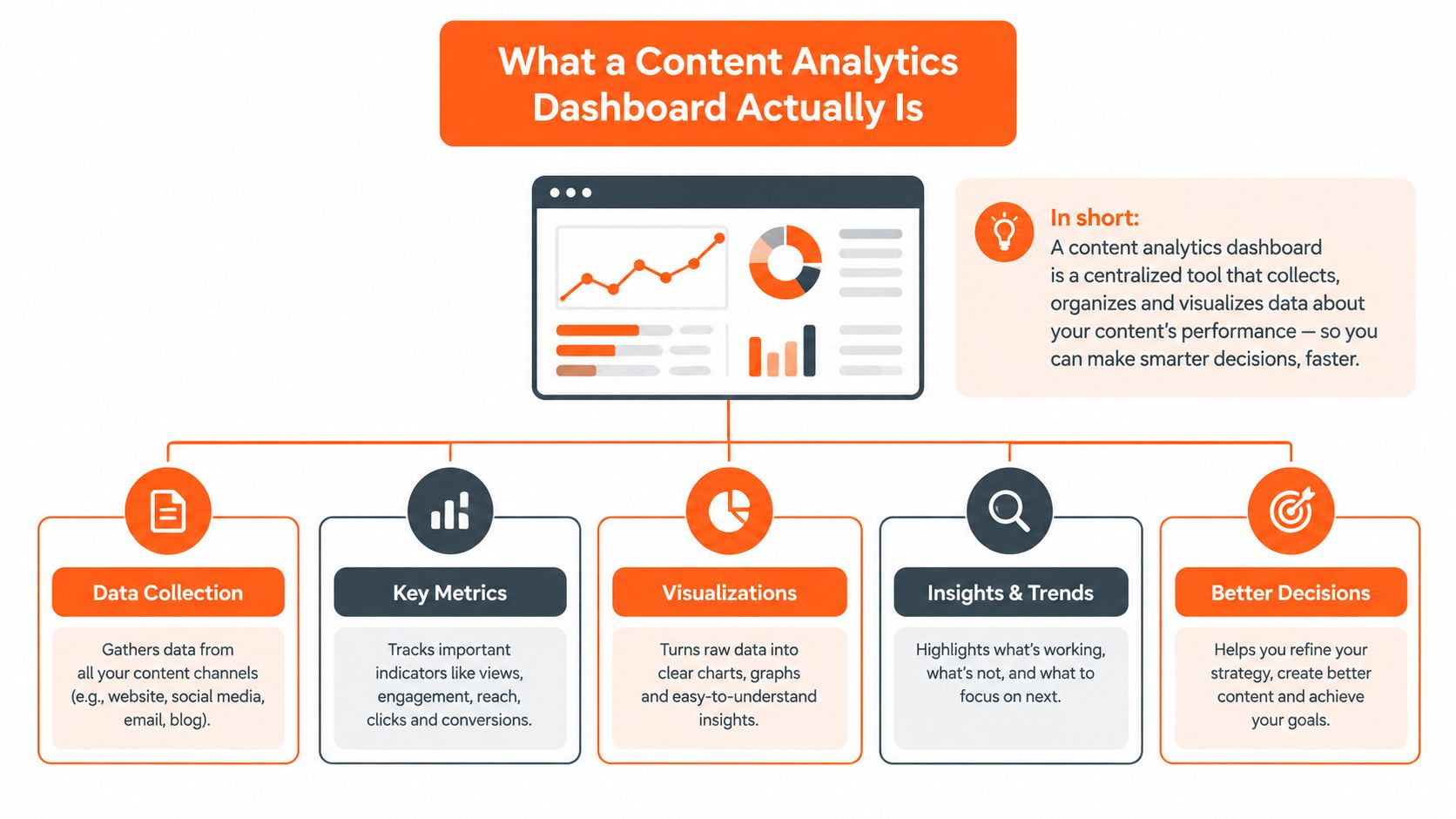
What a Content Analytics Dashboard Actually Is
A content analytics dashboard brings audience, behaviour, conversion, and distribution data into one review surface. Its value is not a claim that every platform measures people the same way. Its value is a shared framework for deciding what deserves another draft, a new channel, or no further effort.
Start with identity. Track unique users, distinct readers, followers, and returning subscribers, then compare short and long windows. A spike may show a successful distribution push. Repeat visits suggest a topic has a stronger audience fit.
Measurement rules can change the interpretation. ServiceNow defines a session as ending after 30 minutes without activity or when the browser tab closes, as described in ServiceNow's content analytics reference. That detail matters when you compare session averages across tools. A longer session may reflect active reading, a forgotten tab, or a platform's different counting method.
Behaviour is the next layer. Average session duration, average time per page, page views, read time, scroll behaviour, and link clicks show whether someone moved beyond arrival. None proves that a reader valued the piece, but the group of signals helps distinguish exposure from attention.
The four questions behind the interface
A useful dashboard answers four questions without sending you to a spreadsheet:
- Who is arriving? Separate new and returning readers, subscribers, followers, and audience segments.
- What are they doing? Review reading time, engagement, clicks, and repeat visits.
- Did the content create an outcome? Track opt-ins, paid conversions, affiliate actions, or another defined event.
- Where did the journey start? Connect the original post or Note with its distribution source.
Conversion belongs beside attention, not underneath it. A post can attract a large audience without producing a subscription, while a smaller group can generate a meaningful action. Keep both outcomes visible.
Distribution adds the publishing context. Impressions, shares, platform-specific engagement, follower movement, and referral traffic show whether a topic can travel. HubSpot's individual content performance documentation uses related measures, including page views, submissions, new contacts, customers, entrances, exits, and source breakdowns.
The Monday decision is the point: choose the piece for a LinkedIn second life, schedule a Substack Note for Thursday, or develop the topic outperforming the rest. A video view and newsletter subscription may sit in one journey, but format-specific reporting should remain distinct. Hooked's overview of all AI video features illustrates why that separation matters.
The Three Metric Families Worth Tracking
A dashboard becomes useful when each metric family supports a Monday editorial decision. Engagement shows whether readers stayed with the work. Conversion shows whether that attention produced a defined outcome. Reach shows whether the subject can travel across platforms.
Use benchmarks as reference points, not publishing targets. For B2B SaaS content, one benchmark guide places organic click-through rate at 2.1%, 3.4%, and 5.2% across the 25th, 50th, and 75th percentiles. Its ranges also include average time on page of 2:45, 3:30, and 4:45, bounce rate of 58%, 51%, and 44%, pages per session of 2.1, 2.8, and 3.6, MQL conversion rate of 1.8%, 2.9%, and 4.5%, and content velocity of 45, 32, and 21 days. See Improvado's content marketing dashboard benchmark guide for the full reference.
| Metric Family | Numbers to Track | Benchmark to Compare Against |
|---|---|---|
| Engagement | Average time on page, read time, pages per session, comments, saves, scroll behaviour | Use your reading baseline alongside the cited B2B SaaS ranges for time on page and pages per session |
| Conversion | Subscriber opt-ins, paid upgrades, affiliate clicks, MQLs, key events | Compare MQL conversion with the cited B2B SaaS range of 1.8% to 4.5% |
| Platform reach | Impressions, clicks, CTR, shares, follower movement, referral sources | Compare organic CTR with the cited B2B SaaS percentile range of 2.1% to 5.2% |
Why the families must stay separate
A post with strong impressions and weak reading time needs a packaging or distribution review. The topic may still work. A post with modest reach and strong opt-ins may deserve a LinkedIn second life rather than a rewrite.
Keep platform measures in their own context. An X repost cannot stand in for a Substack subscription, and a LinkedIn impression does not equal sustained reading. Compare each result with its platform baseline, then connect platforms through a tagged content journey.
A practical content performance metrics reference can help decide which measures belong in the dashboard. The final filter is editorial: if a number cannot change whether you republish, schedule, revise, or develop a topic, remove it from the Monday view.
Reading Cross-Platform Data Without Losing the Plot
A single newsletter essay can look successful, average, or disappointing depending on the platform. I once reviewed an article that produced strong email attention, respectable Medium reading, broad LinkedIn distribution, and almost no visible response on X. Treating those outcomes as one performance result would have produced the wrong conclusion.
The better approach is to assign each platform a primary signal. On Substack, use the relationship signal, such as subscriber movement or email engagement. On Medium, prioritise reading behaviour. On LinkedIn, focus on whether impressions become meaningful interaction or referral activity. On X, inspect how quickly the idea is reposted and discussed.
The exact values will depend on your account and time window, so the worked view should be structured rather than fabricated:
| Platform | Primary Metric | Worked Value | Attribution Gap to Watch |
|---|---|---|---|
| Substack | Subscriber movement or email engagement | Use the post's native dashboard value | Readers may subscribe after seeing the idea elsewhere |
| Medium | Read ratio or reading depth | Use the story's native reading value | A read may not produce a follow or newsletter visit |
| Impressions relative to replies and clicks | Use the post's native distribution value | Comment threads can influence later action outside tracked links | |
| X | Repost velocity and conversation | Use the thread's native activity value | Discovery can happen through reposts without a direct click |
The attribution gap is part of the result
Independent 2026 commentary identifies fragmented reporting, inconsistent definitions, weak attribution depth, undercounted organic impact, dark social, and delayed conversions as persistent measurement problems. That creator performance measurement coverage is particularly relevant when a LinkedIn discussion sends someone to Substack without a tagged link.
That journey can look like this: a reader sees a LinkedIn comment, remembers the writer, searches the newsletter later, and subscribes directly. The conversion is real, but last-click reporting may credit the later visit rather than the original conversation.
Use a reconciliation habit:
- Choose one north-star signal per platform. Don't force every network into the same definition.
- Normalise the review window. Compare the same publishing period instead of mixing yesterday's reach with a long-term total.
- Tag every cross-post. Give the adapted version a recognisable campaign or asset label.
- Record delayed actions. Add a note when a post appears to influence a later subscriber or inquiry.
The cross-platform analytics guide is useful for designing that review surface. The point isn't perfect attribution. It's a more honest explanation of how an idea travelled.
Turning Dashboard Signals Into Writing Decisions
The dashboard became useful when I stopped reviewing it as a report and started treating it as a queue of editorial decisions. My Monday review now begins with the content, not the chart. I open the strongest pieces, check the relevant platform signal, and assign one action.
Run the review in a fixed order
Start with attention. A Substack post with a strong open rate but flat click-through usually needs a clearer next step, not an immediate rewrite of the entire issue. Check whether the call-to-action appears at the right point, whether the link promises something specific, and whether the reader has a reason to continue.
A Medium story with strong reading behaviour but few comments can become a LinkedIn post or carousel. Pull out the sharpest claim, turn it into the opening, and preserve the longer explanation for readers who want depth. An X thread with unusually fast repost activity can signal a topic cluster worth developing into a deeper newsletter piece.
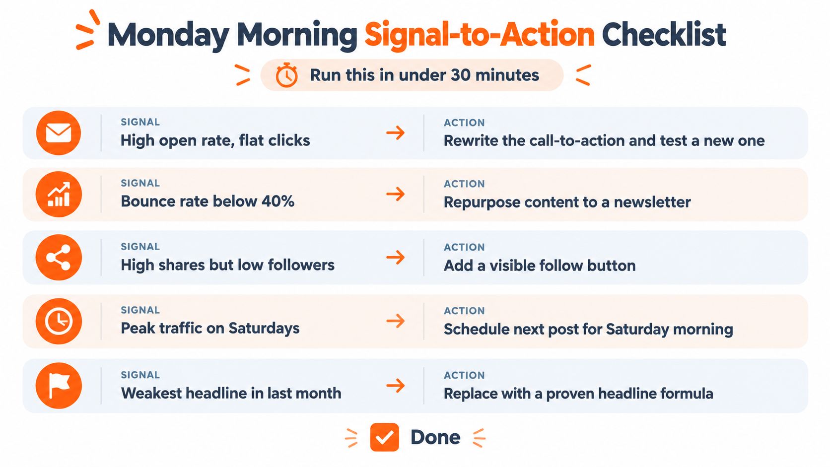
Use a short decision table rather than a vague “optimise the winners” rule:
| Signal | Editorial action |
|---|---|
| Strong attention, weak clicks | Rewrite the CTA and clarify the promised next step |
| Strong reading, weak conversation | Extract the strongest idea for LinkedIn |
| Strong reposting, weak subscriber movement | Publish a deeper follow-up with a direct subscription path |
| Strong subscriber response, weak reach | Repurpose the idea for a wider platform |
| Weak performance across attention and conversion | Refresh the framing before abandoning the topic |
Protect yourself from noisy numbers
Don't kill a format because one post underperformed. First check whether the post had enough exposure to support a conclusion, whether the headline matched the audience, and whether the distribution window was comparable. A single result can suggest a hypothesis, but it can't establish a durable pattern.
I also keep an underperforming topic alive for at least one complete publishing cycle when the underlying idea still fits the audience. The next version might need a different headline, example, format, or platform. That restraint prevents a dashboard from turning every short-term fluctuation into a strategy change.
Finish the review by writing three lines:
- Repurpose: Which existing piece gets a second life?
- Schedule: Which Note or post should go out next?
- Investigate: Which topic is gaining attention without yet converting?
For a more detailed process, this guide to how to analyze content performance can serve as a reusable checklist. The dashboard should leave you with a publishing plan, not another open tab.
From Insight to Distribution Without the Copy Paste Grind
Analytics creates value only when the insight reaches the publishing queue. Otherwise, you've built a more attractive way to discover work you still need to reformat manually.
My preferred workflow starts on Friday. I review the strongest performers, select the ideas with a clear reason to continue, and prepare platform-native versions. By Tuesday, the adaptations are scheduled rather than sitting in a notes app waiting for another burst of energy.
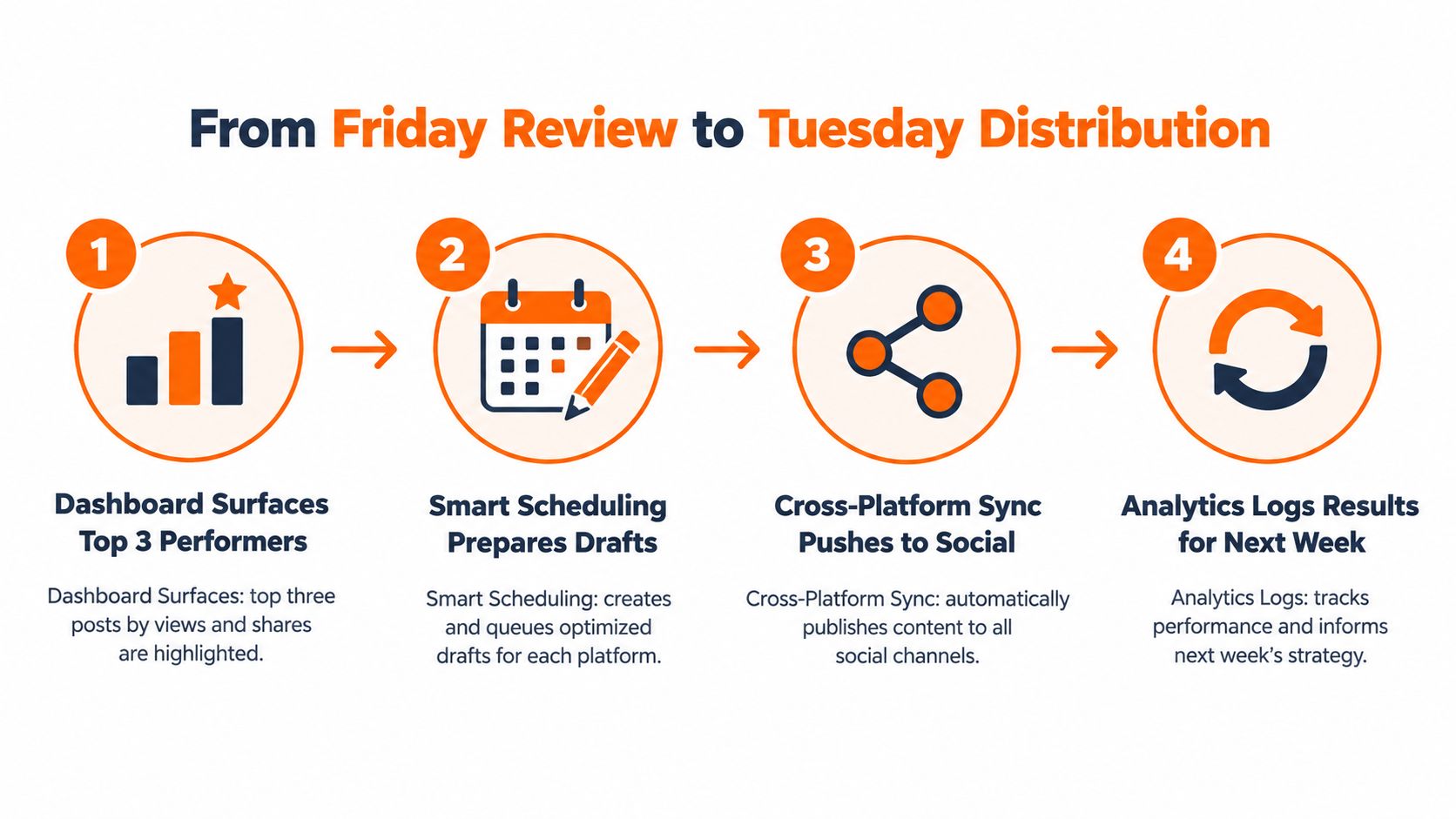
The four-part operating loop
First, surface the candidates. Sort by the signal that matters for the decision. A post with strong subscriber movement may become a Substack Note series. A post with strong LinkedIn discussion may become a follow-up article. A topic with fast X sharing may need a more durable explanation.
Second, adapt the format. Don't publish the same paragraph everywhere. Turn the newsletter's central argument into a Note, the practical framework into a LinkedIn post, and the tension or observation into an X thread. Preserve the idea, but change the entry point.
Third, schedule the queue. Substack's own web interface supports writing a Note, saving it as a draft, and setting a date and time, as described in Substack's scheduling announcement. A broader scheduling system can help you coordinate Notes, Medium articles, LinkedIn posts, and X content in one calendar, provided you still review each adaptation before publication.
Fourth, log the result. Record the source asset, destination platform, format, and publishing window. That label gives the next review enough context to distinguish a weak idea from a weak adaptation.
Practical rule: Automate repetition, not editorial judgement.
A platform such as Narrareach can fit among other scheduling and analytics tools. It combines cross-platform performance review with repurposing and scheduling for Substack, Medium, LinkedIn, and X, so a writer can move from a promising source piece to queued adaptations without copying captions between tabs.
The efficiency gain isn't only the time saved today. Each labelled cycle gives the dashboard cleaner context, which makes the next selection sharper. You learn whether the idea worked, whether the format worked, and whether the timing helped, instead of treating all three as one result.
For a broader framework around this operating model, see the content distribution platform guide. The right system should make consistent distribution easier without turning your writing into a content factory.
Build Your First Dashboard and Pick Your Next Move
Build the first version around a Monday decision, not a complete reporting system. Choose three metrics from each family: engagement, conversion, and reach. Connect Substack, Medium, LinkedIn, and X in one view, while keeping each platform's native definitions visible so a click or view means what it means there.
Open the dashboard every Monday and make three calls:
- Which piece deserves a second life? Select work with a strong signal and a clear adaptation for LinkedIn or another channel.
- Which Note belongs on Thursday? Choose an idea that matches current audience interest and your publishing rhythm.
- Which topic is outperforming? Check for attention across formats and platforms, rather than trusting one isolated spike.
Use the decision immediately. Adapt the winning piece for its next platform, queue the Substack Note or social post, and record the source asset, destination, format, and publishing window. That record lets you separate a weak idea from a weak adaptation during the next review.
The four layers can stay in the background: Identity explains returning readers, Behaviour shows what earns attention, Conversion tracks the intended action, and Reach shows where an idea may travel next.
For your first Monday review, start with returning readers, meaningful engagement, and the target conversion. Together, they show whether an audience came back, whether the work held attention, and whether it prompted the action you wanted.
If you want less manual work, Narrareach supports cross-platform performance review, repurposing, and scheduling for Substack Notes, Medium articles, LinkedIn posts, and X content. Otherwise, run the same review in a simple table for the next publishing cycle.