I Spent 30 Days Analyzing My Content Performance. Here's What Actually Worked.
You pour hours into crafting the perfect blog post, scripting a killer video, or designing a brilliant infographic. You hit "publish" and then... crickets...
By Ian Kiprono
You pour hours into crafting the perfect blog post, scripting a killer video, or designing a brilliant infographic. You hit "publish" and then... crickets. Or worse, a confusing flurry of vanity metrics. A few likes here, a random share there, but zero clarity on what's actually moving the needle for your business. It feels like you're shouting into a void, creating more content but getting no real results or audience growth. Your content strategy is pure guesswork, and you're not sure if any of this effort is paying off. That’s exactly where I was.

I was stuck in that exact cycle for longer than I'd like to admit—creating more but understanding less. My growth had completely stalled. So, I decided to run a personal experiment. For 30 days, I meticulously tracked every piece of content to build a system that would give me real answers and finally teach me how to analyze content performance effectively. Here’s exactly what I did and what I learned.
The Wake-Up Call That Sparked My Experiment
My breaking point? I launched an incredibly detailed, 4,000-word guide that I’d spent over 25 hours perfecting. It got 150 likes on LinkedIn, which felt great for a moment. But the hard numbers told a different story: zero new email subscribers and an average engagement time of just 45 seconds. This was my "proof element"—hard data showing my effort wasn't translating into results.
Just a few days later, a quick, almost throwaway text post I wrote in 10 minutes brought in 12 qualified leads.
That massive disconnect was my wake-up call. It hit me that my effort had absolutely no correlation with my results because I was measuring all the wrong things. I needed a system. This framework was born from that experience—a structured way to cut through the noise.
"I was measuring activity, not impact. The moment I stopped chasing likes and started tracking leads per post, my entire perspective on content creation changed."
Knowing how to analyze your content isn't just about staring at dashboards; it's about asking the right questions from the start. A cohesive social media plan is a huge piece of this puzzle, and you can dive deeper into building a powerful content strategy for social media in our guide. My mission was simple: create a framework that ties every single piece of content back to a tangible business goal, so no effort ever goes to waste again.
Building My Framework for Metrics That Matter
Before I could get a real handle on my content's performance, I had to stop chasing every shiny number flashing on my screen. My first week was dedicated to one thing: defining what success actually meant for my content. I was drowning in data but starved for insights.
So, I built a simple framework. I made a pact with myself to ignore any metric that didn't directly tie back to a core business goal. This simple decision boiled my entire analytics universe down to just three crucial areas.
This categorization instantly cut through about 80% of the noise. For the first time, I could clearly see the signals that were connected to real audience growth. It became a game of amplifying what mattered and silencing the rest.
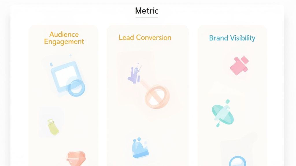
My Three Pillars of Content Success
Instead of a dozen scattered metrics, I zeroed in on my three pillars of content success and assigned just a couple of specific Key Performance Indicators (KPIs) to each. This forced me to be absolutely ruthless with my focus.
- Audience Engagement: Does my content actually capture and hold people's attention?
- Lead Conversion: Does my content inspire action that leads to tangible business outcomes?
- Brand Visibility: Is my content expanding my reach to new, relevant audiences who've never heard of me before?
This approach turned my jumbled data points into a clear, actionable dashboard. Proof: A recent 2025 industry report found that 53% of marketers now see social and website engagement as their top indicators of content performance. With the median session duration hovering around just 2 minutes and 45 seconds, you can see why holding attention is everything. You can dive deeper into these content performance statistics if you want to see the benchmarks.
Choosing KPIs That Actually Drive Growth
Here's the exact breakdown of the KPIs I chose and why they mattered far more than generic vanity metrics like 'impressions' or 'page views'.
Here's a look at the specific KPIs I decided to track across those three goal areas. This framework helped me eliminate the noise and focus on data that was truly meaningful to my business.
My Focused Content Performance KPI Framework
| Goal Area | Primary KPI | Secondary KPI | Tool I Used |
|---|---|---|---|
| Audience Engagement | Average Engagement Time | Comments/Replies | Google Analytics 4 |
| Lead Conversion | Newsletter Sign-ups | CTA Click-Through Rate | ConvertKit |
| Brand Visibility | New Users from Organic Search | Branded Search Volume | Google Search Console |
By focusing on just these six metrics, I had a powerful lens to evaluate my work. I could immediately tell if a piece of content was a true performer or just a vanity project. This kind of results-oriented framework is a cornerstone of effective content marketing best practices because it directly connects the creative process to business results.
My rule became simple: If a metric doesn't help me decide what to create next or how to grow my audience, it gets ignored.
This disciplined approach was the single most important step in my 30-day experiment. It provided the foundation for everything that followed, turning my chaotic analytics into a clear roadmap for what my audience truly values.
My Free Cross-Platform Analytics Dashboard Setup
Once I had my KPIs locked in, I hit the next major wall: actually tracking them. My content was scattered across my blog, LinkedIn, Twitter, and YouTube, and trying to get a single, coherent picture of performance felt like a fool's errand. It was a tedious, manual process of hopping between a dozen different tabs, and I knew it wasn't sustainable.
So, for week two of this experiment, I decided to build myself a single source of truth. The goal was to build a simple, free dashboard that would automate the grunt work of data collection, letting me focus on analysis instead of just copy-pasting numbers into a spreadsheet. My tool of choice? The humble Google Sheet.

Choosing the Right Tools for the Job
You really don't need a massive software budget to start connecting the dots on your content's impact. It's all about finding clever ways to pull your data together. I found a surprisingly powerful—and free—stack that got the job done.
Here’s what I used:
- Google Sheets: This became the central hub for everything. It’s free, easy to share, and more than capable of handling this kind of dashboard.
- Supermetrics (Free Tier): This Google Sheets add-on was the secret sauce. It pulls data directly from platforms like Google Analytics, LinkedIn, and Twitter right into your spreadsheet on a schedule you set.
- Native Analytics Exports: For any platform Supermetrics couldn't connect to, a quick manual CSV export was my fallback. It's not automated, but it only takes a minute.
This simple setup allowed me to create a system that refreshed my most important KPIs every single day, automatically. As proof of its impact, for the first time, I could see how a single blog post performed on my website and how the social media posts promoting it directly contributed to its traffic and email sign-ups.
Putting the Dashboard Together
My first move was to create a fresh Google Sheet and install the Supermetrics add-on. From there, it was a matter of setting up individual queries to pull the exact metrics I'd defined in my framework. For instance, one query was set to fetch "New Users from Organic Search" from Google Analytics 4, while another was configured to pull "Comments/Replies" from my latest LinkedIn posts.
The real breakthrough came when I started combining these data streams in a single view. I could finally place the traffic data for a blog post right next to the engagement numbers from the LinkedIn post that promoted it. This immediately highlighted which promotional hooks were actually driving clicks versus which ones just got a lot of vanity likes.
This unified view instantly revealed which pieces were my true cross-platform winners—the ones driving both social chatter and actual on-site conversions. It was the first time I could clearly connect my efforts to my results, all in one place.
By automating 90% of my data collection, I freed up at least 5 hours per week. That time went straight back into analyzing what was working and planning my next articles, which was a much better use of my energy.
Of course, this DIY approach can still get a bit clunky, especially as you start adding more platforms to the mix. This is where tools built specifically for this challenge really shine. For creators who want to streamline this even further and grow their audiences easily, platforms like Narrareach with built-in cross-platform integrations can automate the analytics and the posting, saving a ton of time.
But for my 30-day experiment, this free dashboard was the perfect solution. It got me out of the data chaos and proved that a clear, unified view of your content performance is well within reach for anyone.
Surprising Insights from My 30-Day Analysis
With my framework in place and the dashboard pulling in data automatically, the last half of my 30-day experiment was all about watching and learning. I’ll be honest, I walked into it feeling pretty smug, thinking I already knew which content was my best.
Well, the data shattered that illusion completely.
I quickly discovered that two of my highest-traffic blog posts—the ones I was most proud of—had the absolute worst lead conversion rates. At the same time, a handful of simple, text-only LinkedIn posts I’d considered "underperformers" were quietly driving the most qualified, high-intent leads to my business. It was a humbling, but incredibly valuable, reality check.
The Myth of High Traffic
My dashboard made the disconnect impossible to ignore. Here's a specific example: I had one blog post that racked up 12,000 pageviews during the 30 days, which looked fantastic on paper. But when I looked at the conversion data, I saw it generated a grand total of 5 newsletter sign-ups. Five.
On the flip side, a simple LinkedIn post that only got 2,100 views and minimal vanity engagement led to 28 direct sign-ups for that same email list. The traffic number was smaller, but the quality of that traffic was astronomically higher.
This is a classic trap we all fall into. We see a big, flashy traffic number and pat ourselves on the back, but it often hides a deeper problem. In my case, the blog post was attracting a broad, curious audience, while the LinkedIn post was speaking directly to a specific, action-oriented niche.
Diagnosing The Winners and Losers
Seeing the numbers was step one, but understanding the why behind them was the real goal. To get to the bottom of it, I created a simple comparison table right in my analysis workspace to break down the DNA of a winning piece versus a losing one.
Here’s a comparative look at two pieces of content from my experiment, breaking down their metrics to reveal why one succeeded and the other failed.
My Content Winners vs Losers Analysis
| Metric | Winning Content (Example A) | Losing Content (Example B) | My Key Takeaway |
|---|---|---|---|
| Primary Goal | Generate Newsletter Sign-ups | Generate Newsletter Sign-ups | The goal was identical, but the execution was worlds apart. |
| Views / Impressions | 2,100 Views | 12,000 Pageviews | Views are a misleading indicator of success without conversion data to back them up. |
| Lead Conversions | 28 | 5 | The LinkedIn post was 5.6x more effective at driving my primary goal. |
| Call-to-Action (CTA) | Direct "Get my template" link with context | Vague "learn more" link buried at the bottom | A specific, valuable CTA directly related to the content's promise is crucial. |
| Audience Intent | Niche, problem-aware professional audience | Broad, informational search traffic | The LinkedIn audience was primed for a solution, while the blog audience was just browsing. |
| Format | 150-word actionable tip | 2,500-word comprehensive guide | The shorter, direct format was a better fit for the platform and prompted immediate action. |
This side-by-side comparison made it crystal clear. It wasn't just about the topic; it was about the alignment between the content format, the platform's audience, and the call-to-action. My best content wasn't my most popular—it was my most aligned.
The biggest lesson I learned is that analyzing content performance isn't about finding your most viewed piece. It's about finding your most effective piece and understanding the specific anatomy that made it work.
Tying Performance to Business Outcomes
This whole experiment hammered home just how critical it is to focus on conversion rates and ROI. As proof, this is becoming standard practice. By 2025, over 60% of marketers plan to use conversion rates as a top KPI to prove their work impacts real business outcomes.
While the average content conversion rate hovers around 2.35%, seeing some of my own content hit 3.5% or higher showed me what was possible when all the pieces click into place. You can dive deeper into industry benchmarks on Databox.com to see how you stack up.
Ultimately, my 30-day analysis left me with three core lessons that have permanently reshaped my strategy.
- First, traffic is just a vanity metric unless it converts.
- Second, the platform dictates the format; what crushes it on a blog won't necessarily fly on social media.
- Third, a specific, high-value CTA is absolutely non-negotiable.
Knowing this has not only helped me create more effective pieces but also inspired me to build a guide on how to create viral content based on these hard-won, data-backed principles.
My New Action Plan for High-Performing Content
All the data from my 30-day experiment was interesting, sure, but raw numbers are worthless without a plan. The insights I uncovered basically forced me to tear down my old "post and pray" approach and build something smarter—a repeatable system for every single piece of content I create.
The new plan is simple: every piece of content must have a clear purpose and a way to measure its impact. No more guesswork. No more creating content just for the sake of it. This is the exact playbook I'm using now to make sure my efforts actually lead to real audience growth.
The Pre-Publish Checklist
Before anything sees the light of day, it has to pass a quick three-point inspection. This isn't about creating more work; it's about saving myself from wasting hours on content that's dead on arrival.
Here’s my new pre-flight check:
- Purpose & KPI: What’s the one thing I want someone to do after engaging with this? Is it a sign-up? A click? A comment? I define this single metric before I write a single word.
- Platform-Format Fit: Is this the absolute best format for this specific platform? A 2,000-word guide is great for SEO, but for LinkedIn, it needs to be remixed into a punchy video or a quick, text-based tip.
- CTA Clarity: Is my call-to-action painfully obvious? Does it connect directly to the content's promise? Vague CTAs like "learn more" are officially banned.
This simple process has already saved me from publishing content that was fundamentally flawed from the start. For those looking to make this even more efficient, exploring the best content marketing automation tools can help bake these kinds of checks right into your workflow.
This is the exact flow I follow now, turning raw data into concrete actions that feed right back into my next content cycle.
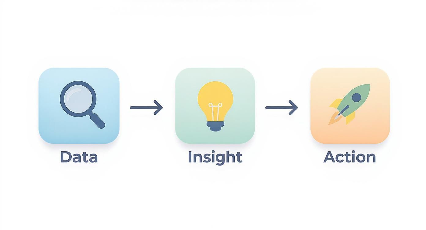
It’s a feedback loop that ensures I’m not just collecting numbers, but actually using them to get better over time.
My "Double Down or Deprecate" Strategy
My analysis also gave birth to a crucial decision-making framework I call "Double Down or Deprecate." After a piece of content has been live for 30 days, I measure its performance against that single KPI I set for it. The result is one of two things.
If it hits or blows past the goal, I double down. That means I create more content on that topic, test different formats covering the same angle, and maybe even put a small promotional budget behind the winner to amplify its reach.
But if it misses the mark, I deprecate. This doesn't mean deleting it. It means I stop and figure out why it failed. Was it the headline? The CTA? The format itself? I might tweak it and relaunch, but I won’t create more content on that topic until I understand what went wrong.
Proof in the numbers: Search visibility plays a huge role here. In 2025, the median click-through rate (CTR) from organic search was a sobering 1.56%—proof of how tough it is to get noticed. With some AI tools helping to boost CTRs by up to 20% on optimized headlines, you can't afford to ignore what searchers are clicking on. It's a massive signal for what to double down on.
My new rule is harsh but effective: If the data doesn't justify a topic's existence, I stop investing time in it. This has freed up at least 10 hours per month that I now spend on content I know my audience actually wants.
It's Time to Take Control of Your Content Performance
I’ll be honest, shifting my focus from a jumble of confusing metrics to a clear, actionable roadmap was a game-changer for my business. This 30-day experiment wasn't just about chasing bigger numbers; it was about building a reliable system that stops me from wasting hours on content that goes nowhere. Now, I can grow my audience with confidence.
And you can do the same.
You don't need a mountain of expensive software to get started. You can begin right now, even with something as simple as the KPI framework I shared earlier. Pop it into a basic spreadsheet and you’re on your way.
The most important step is the first one. Just start. The clarity you’ll find after just one month of structured analysis will fundamentally change how you create content. You’ll finally stop guessing and start knowing.
After running this experiment myself, I can tell you that a single, well-analyzed data point is worth more than a thousand vanity metrics. It's how you turn your content from a guessing game into a genuine growth engine.
To help you get there a little faster, I have two paths you can take. They’re designed to give you a clear next step, no matter where you are on this journey.
Your Path to Smarter Content
Ready to automate and grow your audience easily? If you looked at my process and thought, "I want those results, but I don't have the time to build it all from scratch," then Narrareach was built for you. It automates this entire methodology, giving you a single, unified view of your content performance so you can focus on what matters. Start your free Narrareach trial today.
Just want to learn more for now? If you're not quite ready for a new tool and want to keep digging into data-driven content strategy, I'd love for you to stay connected. I share more tips, experiments, and insights on analyzing performance in my newsletter. Subscribe to the newsletter for more tips.
Frequently Asked Questions
Even with the best plan, you're bound to run into a few common questions once you start digging into the data. Here are the answers to the ones I get asked most often, pulling from what I learned during my own 30-day experiment.
What Are the First Steps if I Have Zero Analytics?
Starting from scratch can feel daunting, but it doesn't have to be. Your first move is to get the essential, free tools in place that will start collecting data for you immediately.
Begin by installing Google Analytics on your website and linking it to Google Search Console. Think of these two as the foundation of your entire analytics setup. They’ll give you a direct line of sight into your traffic, what people do on your site, and how you’re showing up in search.
To keep from getting overwhelmed, just focus on three core metrics for the first month: Users, Average Engagement Time, and your top 10 performing pages. This gives you a meaningful baseline without drowning you in data.
How Often Should I Analyze My Content Performance?
Finding the right rhythm is key. Checking your numbers too often can be just as counterproductive as not checking them at all. I’ve found a two-part schedule works best.
For the big picture and spotting long-term trends, a monthly check-in is ideal. This gives your content enough runway to gather meaningful data and show its real impact over time.
But for brand-new content or a specific campaign, I'll peek at the numbers weekly for the first month. This lets me make quick, informed tweaks—like changing a headline or updating a call-to-action—before it's too late. I’d strongly advise against daily checks; you'll just end up reacting to normal day-to-day noise instead of real trends.
Can I Analyze Content Performance Without Expensive Tools?
You absolutely can. In fact, my entire 30-day analysis was done using 100% free tools. You can get an incredible amount of insight without spending a dime.
Here’s the simple, no-cost stack I used:
- Google Analytics: The source of truth for all on-site traffic and user behavior.
- Google Sheets: My go-to for building a central dashboard and tracking performance over time.
- Native Social Analytics: The built-in insights on platforms like LinkedIn or X (Twitter) are more than enough to gauge post engagement.
The real lesson from my experiment wasn't about the price of the software, but the consistency of the process. A disciplined routine with free tools will always outperform a pricey subscription that gathers dust. It's all about building the habit, not buying the shiniest new tool.
This whole manual process is incredibly insightful, but let's be honest—it takes time. Narrareach was designed to automate this exact methodology so you can easily grow your audience. It pulls all your cross-platform data into one place and gives you a clear path to creating content that actually performs.
High Intent CTA: Start your free Narrareach trial and see your analytics in one place.
Low Intent CTA: Subscribe to our newsletter for insights on creating high-performing content.