How to Turn a Blog Post Into a Carousel (With a Real Example)
How to turn a blog post into a five-slide carousel for Instagram, TikTok and LinkedIn: what goes on each slide, the right sizes, and a real example.
By Ian Kiprono
Quick answer: To turn a blog post into a carousel, pull out five ideas: a hook, three takeaways and a closing point. Cut each one to a headline and two or three sentences, and set them on 1080 x 1350 portrait slides. Post the slides as images on Instagram and TikTok, and as a PDF document on LinkedIn. Narrareach pulls the ideas from the article you already wrote, writes and typesets the slides and caption, and lines them up for each platform. Your part is the final approval and choosing when they go out.
Long articles usually stop at the newsletter. A carousel would reach people who never click through, but making one by hand means an evening in a design tool, pasting paragraphs into templates and nudging text boxes until slide three stops overflowing.
This guide covers how to do it well, by hand or with a tool. It finishes with a real carousel I made from one of my own articles, so you can see what the output looks like before you change your workflow around it.
Why turn a blog post into a carousel at all?
An article and a carousel do different jobs. The article holds the full argument and is where readers subscribe. The carousel earns a few seconds of attention in a feed where nobody planned to read you today, and gives them enough of the argument to decide whether the full piece is worth their time.
The swipe matters too. Every slide someone moves through is a small decision to keep going, and a five-slide sequence asks for five of those. A wall of text in a caption asks for one, and most people say no.
The important part is that you are not writing anything new. The ideas, examples and wording already exist. The work is choosing and compressing, and that is the part most people skip because it feels like a second writing job.
How do you pick which ideas go on the slides?
Five slides is the shape I keep coming back to, and it is the shape Narrareach uses:
- Slide 1, the hook. The article's main promise, as a headline. Your SEO title is usually a good starting point because you already wrote it to earn a click.
- Slides 2 to 4, three takeaways. Three separate ideas from the body of the piece. If two of them say the same thing in different words, drop one and find another.
- Slide 5, the closing takeaway. What the reader should believe or do now. Not "link in bio" and not a sales pitch, just the conclusion of the argument.
A quick test for each takeaway: could someone who only read this slide repeat the point to a friend? If the slide needs the previous one to make sense, it is a transition, not a takeaway.
Your section headings are the best raw material. In a well-structured article, each H2 is already a claim. Read only your headings and you will usually find three of the five slides waiting.
How much text should each slide have?
Less than you think. A headline of under ten words and a body of two or three sentences, around 200 characters, is plenty. Longer than that and readers stop swiping and start skimming.
When a takeaway really is a list (three steps, four kinds of something), set it as a short list rather than squeezing it into a sentence. When it is not a list, do not force one. Bullet points with one word each look organised and say nothing.
Two rules I hold myself to:
- Nothing on the slides that is not in the article. No rounded-up statistics, no quote you half remember, no promise the piece never made. A carousel that claims more than the article is worse than no carousel.
- Read the last slide twice. It is the one most likely to run long, because conclusions invite one more clause. Cut it until it ends cleanly.
What size and format should a carousel be?
For Instagram, use portrait images at 1080 x 1350 pixels, a 4:5 ratio. It takes up the most screen space in the feed, and Instagram uses one orientation for the whole set, so keep every slide the same size.
TikTok photo posts take the same portrait images with a description. On TikTok I post the identical slides and rewrite the caption to be shorter and more conversational.
LinkedIn is the exception. A native LinkedIn carousel is a document post: you upload a PDF and LinkedIn shows it page by page with a swipe. Export your five slides as one PDF and upload that. Links on slides inside a document cannot be clicked, so put the article link in the post text. I covered the exact dimensions in more detail in the LinkedIn carousel size test, and the posting steps in how to post a carousel on LinkedIn.
| Platform | Format | Size | Where the link goes |
|---|---|---|---|
| Multi-image post | 1080 x 1350 (4:5) | Profile links; captions are not clickable | |
| TikTok | Photo post | 1080 x 1350 works | Profile |
| PDF document post | 1080 x 1350 pages | Post text | |
| Single Pin, not a carousel | 1000 x 1500 (2:3) | The Pin's link |
How do you make the slides by hand?
- Copy your headings and one key sentence from each section into a plain document.
- Choose the hook, three takeaways and closing point from that list.
- Rewrite each to a headline plus two or three sentences. Read them aloud. If you stumble, shorten.
- Build one slide template at 1080 x 1350 with a fixed headline position, body position and slide number. Use it for all five so the set looks like one piece.
- Export five PNG or JPG files for Instagram and TikTok, and one PDF for LinkedIn.
- Write the caption: one or two sentences on why the idea matters, then where to read the full piece.
- Schedule each platform separately.
Done carefully, most of the time goes into steps 3 and 4: compressing the writing and fitting it to a template. Those are the steps worth automating.
A real example: one article, five slides
Here is the same job in Narrareach. I open the Generate menu, choose Instagram / TikTok Carousel and pick the article. For this test I used an article I published on Substack, I Asked Claude to Handle Our Customer Support. It Started Delegating the Work. Its saved SEO title, "How I Used Claude AI for Customer Support", filled in as the cover headline. I chose the Illustrated style, added no art direction and pressed Generate.
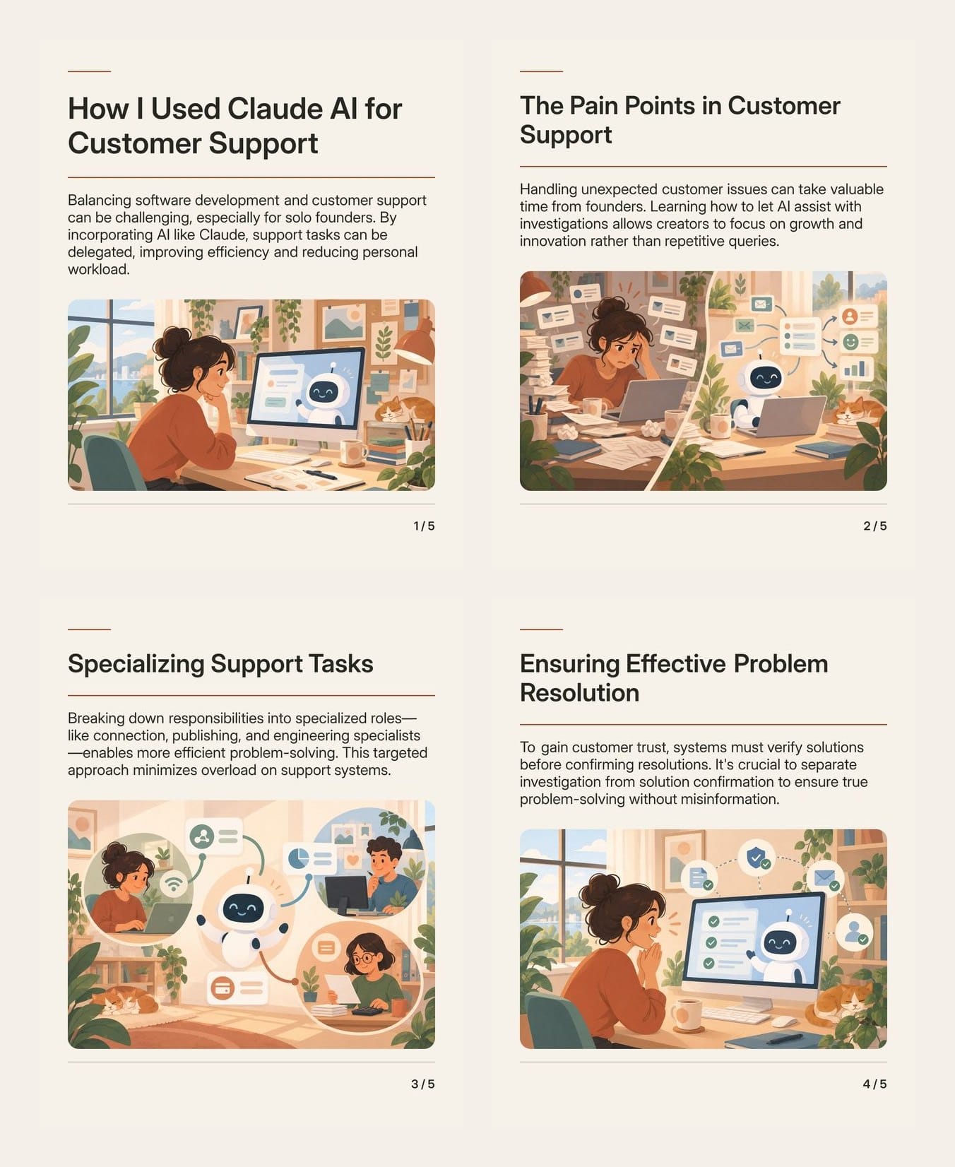
The four headlines after the cover came from the body of the article: The Pain Points in Customer Support, Specializing Support Tasks, Ensuring Effective Problem Resolution and The Future of Automated Support. Each one matches a section of the original argument. Slide three, about splitting support work between connection, publishing and engineering specialists, follows the article almost line for line, which is exactly what I want. The carousel is a summary of my piece, not a new piece.
A few details I paid attention to:
- The words are typeset, not drawn. The illustrations come from an image model, but every word on the slide is set in real type afterwards, so spelling is exact. Any picture that comes back with text in it is thrown away.
- The pictures share one style. The first slide's picture is the reference for the rest, so the set reads as a series.
- The closing slide was the weak one. Its body text ran long and ended mid-sentence, so I would not have scheduled it as it was. That is the slide I tell everyone to check, and here it earned the warning. I traced the cause to how the slide copy was generated and fixed it, so a slide that would run long is now caught before it reaches you.
From the same window I can write the caption, pick Instagram, TikTok or LinkedIn and set one date and time. The LinkedIn Carousel format produces the same five slides as a PDF document instead of images.
How should you schedule the carousel around the article?
Do not post everything on publish day. A spread that works for me:
- Day 0: the article goes out to subscribers.
- Day 1 or 2: the Instagram carousel, with the article added to your profile links first.
- Day 3 or 4: the same slides on LinkedIn as a document post, with the article link in the post text.
- Later that week: a few Substack Notes built from the same article, each carrying one idea.
One article becomes four or five pieces across a week, and none of it is written from scratch. If you want the whole week in one queue, a content scheduler that handles both text and images saves you from logging in to four apps.
Frequently asked questions
How many slides should a carousel made from a blog post have?
Five is a good default: a hook, three takeaways and a closing point. Fewer and the carousel feels thin. More and you are usually padding with transitions.
Can I use the same carousel on Instagram and LinkedIn?
Yes, with one change. Instagram takes the slides as images, and LinkedIn takes them as one PDF document. Keep the same slides and rewrite the caption for each audience.
Should the carousel include the article link?
Put it where it can be clicked. On LinkedIn that is the post text. On Instagram, add it to your profile links, because captions and images are not clickable.
Can AI turn my blog post into a carousel?
Yes. Narrareach turns an article into a five-slide carousel, typesets the words, adds a caption and schedules it. Read every slide before scheduling, especially the last one.
Which plan includes carousel generation in Narrareach?
Revenue Writer ($39/month) and Full Agentic Mode ($89/month), plus the 7-day trial. Each slide uses one image from a daily allowance of 25 or 50 images.
Start from the article you already wrote
The hardest part of a carousel is not the design. It is deciding which five ideas carry the piece and saying each one in a couple of sentences. Do that once, by hand or with a tool, and every long article you publish has a second life in the feed. If you want to try it on your own archive, start with one article you are already proud of.