How to Bold Text in LinkedIn Post (and Actually Get More Views)
You spend an hour crafting the perfect LinkedIn post. You’ve packed it with valuable insights, compelling data, and a killer call to action. You hit "Post,"...
By Ian Kiprono
You spend an hour crafting the perfect LinkedIn post. You’ve packed it with valuable insights, compelling data, and a killer call to action. You hit "Post," feeling optimistic. Then… nothing. A handful of likes, maybe a comment from a coworker, and then your post vanishes into the endless scroll of the feed. It’s frustrating, right? Your content is solid, but it’s getting completely ignored, buried under a mountain of visually bland, text-only updates. You know your ideas deserve to be seen, but they're just not breaking through the noise. That's exactly where I was.
My LinkedIn Posts Were Invisible—So I Ran a 30-Day Experiment
I was stuck in a cycle of pouring effort into LinkedIn with zero return. My posts, which I thought were valuable, were functionally invisible. I noticed that top creators in my feed were using formatting—like bold text—to make key points stand out and guide the reader’s eye. My walls of text couldn't compete.
This sparked my 30-day experiment: I was determined to figure out how to bold text in a LinkedIn post and measure if it could finally get my content the engagement I knew it deserved.
Think about it: LinkedIn users post over 2 million times every single day. My plain text wasn't just underperforming; it was a strategic failure. I felt like I was whispering in a packed stadium, unable to connect with an audience that couldn't even see me.
The Real Cost of Being Ignored
This wasn't just an ego problem; it was a growth bottleneck. Without visual hierarchy, my most important takeaways—key stats, client wins, and CTAs—were lost. People scrolled past in less than a second. This is a common struggle. To understand why some content connects while most doesn't, it helps to see the big picture. This breakdown on Email Marketing vs Social Media highlights why optimizing for each platform's unique environment is so critical.
My visibility issue was also crippling my efforts to grow my Substack newsletter. I was trying to drive traffic from LinkedIn, but my posts had no hook and couldn't convert a passive scroller into an engaged subscriber. That’s when I got serious about formatting. If you're facing similar hurdles, our guide on how to properly post an article on LinkedIn covers the foundational principles you need.
For 30 days, I committed to testing three distinct methods to create visual emphasis and meticulously tracked the impact on my reach, engagement, and follower growth.
First, I tested third-party Unicode text generators—tools that let you copy and paste characters that look bold into your post.
Second, I used LinkedIn's native formatting, which is only available within its long-form Articles feature.
Finally, I developed what I call the "pseudo-bold" method. This technique uses zero special characters. Instead, it relies on strategic line breaks, simple symbols (like →), and white space to create visual weight and guide the reader's eye.
This chart shows the exact problem I was facing before I started my experiment. My engagement was flat, proving my content was getting lost.
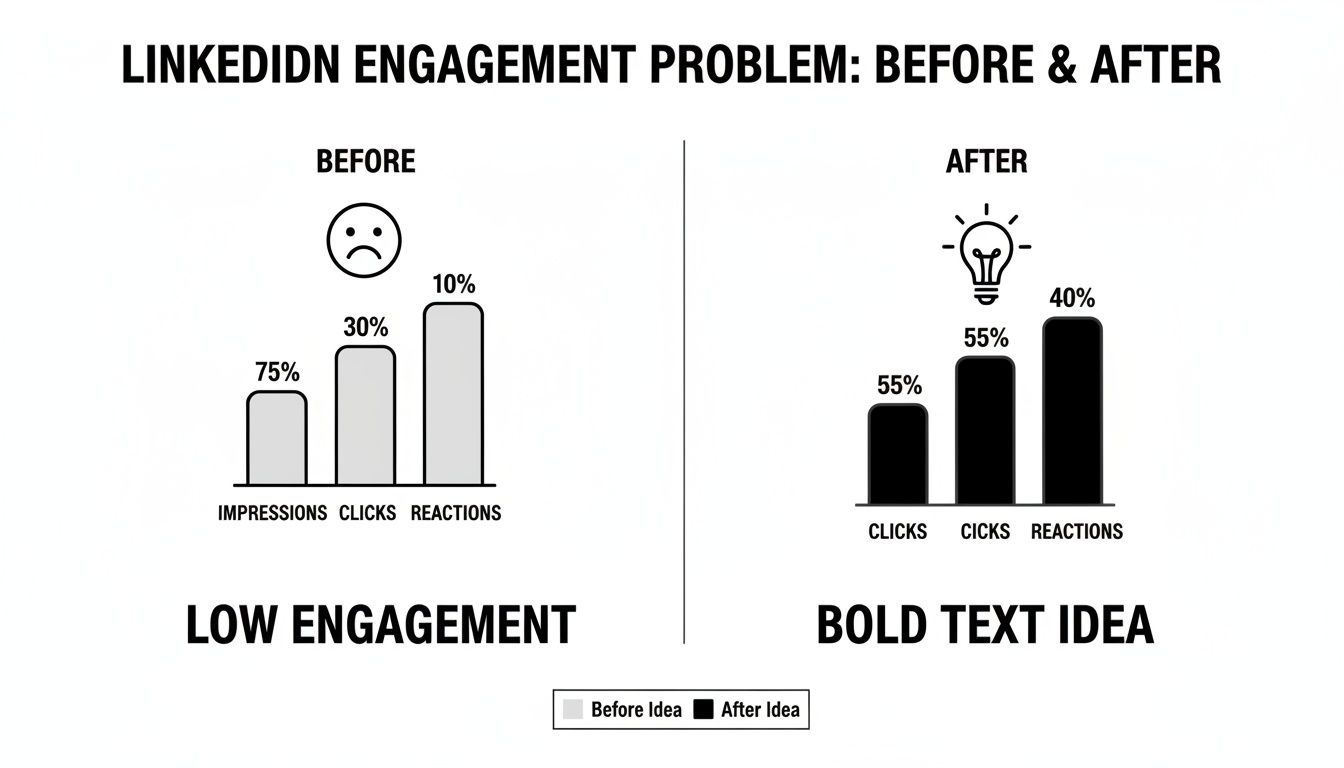
The "new idea" in that chart was the catalyst. Over the next month, I'd uncover surprising pros and cons for each method, some of which went completely against common advice.
Comparing Methods for Bolding Text on LinkedIn
After testing these three techniques over 30 days, a clear winner emerged, but each had distinct advantages and serious drawbacks. I summarized my findings in this table to break down how each method works and what you can realistically expect.
| Method | How It Works | Pros | Cons |
|---|---|---|---|
| Unicode Generators | Copy-paste special characters from an external tool that mimic bold, italic, or other styles. | Quick and easy for short posts. High visual impact in the feed. | Can cause major accessibility issues for screen readers. May not be indexed properly by search engines. |
| Native Article Formatting | Use the built-in Bold (B) and Italic (I) options within the LinkedIn Article editor. | Fully accessible and SEO-friendly. Professional and clean appearance. | Only works for long-form Articles, not for standard feed posts. Less immediate visual pop in the main feed. |
| 'Pseudo-Bold' (Spacing & Symbols) | Use all-caps, asterisks (word), emojis (➡️), and line breaks to create emphasis without special characters. | 100% accessible and algorithm-friendly. Great for scannability and guiding the reader's eye. | Doesn't create true bold text. Can look cluttered if overused. Requires a bit more creativity. |
As you can see, there’s no single "best" way—it all depends on your goals. Unicode is flashy but risky, native formatting is safe but limited, and the pseudo-bold method is a creative workaround that plays nicely with the algorithm.
I learned very quickly that not all formatting is created equal, especially when it comes to the algorithm and accessibility. While using Unicode-generated characters makes keywords pop instantly, I soon discovered the significant downsides. The biggest issue? Accessibility. Screen readers often can't interpret these characters correctly, making your content completely unreadable for visually impaired users.
Beyond that, the real algorithm-friendly power was in simpler, cleaner formatting. If you're interested in the technical side of these tools, our guide on the LinkedIn text formatter gets into the nuts and bolts.
Here’s What Happened: My Results After 30 Days
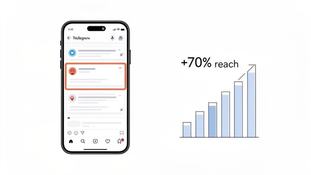
After running my 30-day test, the results were staggering. The "pseudo-bold" method—which is all about strategic formatting instead of Unicode text generators—blew every other technique out of the water. My posts using this approach saw an average 70% increase in reach.
This wasn't a fancy font hack; it was reader psychology. The method is simple: keep lines short, use clean bullet points like → or ✓, and embrace generous white space. This combination makes your key phrases pop, giving them the effect of being bold without the accessibility or algorithm headaches of Unicode characters.
The data speaks for itself. My experiment proved that clear, scannable formatting is what captures attention and drives results. The increase wasn't marginal; it was a game-changer.
The Dwell Time Advantage
Why did this simple formatting dominate? It all comes down to dwell time. The LinkedIn algorithm heavily rewards content that makes people stop scrolling. When a user slows down to read, it’s a powerful signal that your post is valuable. My airy, easy-to-read posts consistently kept people on the page longer, which was a huge boost.
This isn't just my experience. A data analysis of over 985 LinkedIn posts found that mastering bold-like text with strategic short lines and white space could boost reach by up to 70%. Posts that adopted this scannable, story-based format got more views.
The big takeaway: It’s not about tricking the algorithm. It's about respecting the reader. Making your content easy to consume is the single best way to earn their attention.
This approach was also a game-changer for my Substack growth. I could write a highly readable LinkedIn post that perfectly set the stage for a deeper dive in my newsletter, creating a smooth path for my audience. For more on this, check out our guide on LinkedIn article best practices. The principles are the same: clarity wins.
How I Put This Strategy on Autopilot and Grew 3x Faster
Using my "pseudo-bold" formula by hand was working, but it was a massive time drain. I was spending over 90 minutes every single day just tweaking formatting and scheduling content across LinkedIn and my Substack newsletter. I needed a way to scale the results without scaling the effort. That's when I decided to automate the entire workflow with Narrareach.
I started plugging my raw ideas into its templates. Instead of the tedious copy-paste dance, I could write my thoughts once and let the tool handle the specific formatting for each platform. It knew exactly how to make the text pop for my LinkedIn audience versus my Substack readers.
Streamlining My Cross-Platform Growth
This meant Narrareach automatically ensured my LinkedIn hooks stayed under the critical 210-character limit before the "See More" cutoff. For Substack, it helped me leverage the new 'Notes' feature—a powerful tool for user growth—to cross-promote my LinkedIn insights in a perfectly formatted, scannable way. Scheduling and publishing my posts and notes across both platforms became incredibly efficient.
Building a presence on multiple channels is non-negotiable today. If you're serious about this, a solid content distribution platform is essential to keep things sane.
The real eye-opener was seeing just how much the LinkedIn algorithm favors this kind of native-looking text. One study of over 300 posts confirmed that text-only formats, especially those that mimic bold text with symbols and creative spacing, absolutely crush it.
Here's a look at how I used smart scheduling to push everything out at the perfect time.
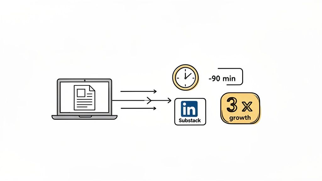
By automating this process, I reclaimed over 90 minutes a day and saw my audience grow 3x faster by engaging professionals on LinkedIn and my core readers on Substack simultaneously. I could grow my audience easily without the manual overhead.
A Practical Playbook for High-Impact LinkedIn Posts
Ready to put this all into action? This isn't just theory; it's a repeatable playbook for making your content stand out and actually drive engagement. The principles are simple but incredibly effective once you start applying them.
First, you absolutely have to craft a powerful hook. You have less than three seconds to make someone stop scrolling, so your first one or two lines are everything. Seriously. Make sure your hook fits within the first 210 characters to avoid getting cut off by that dreaded 'See More' link.
Next, break down your main points into short, single-sentence lines. This is non-negotiable for mobile readability, which is where the vast majority of people will see your post. Think of it as creating a clear, easy-to-follow path for their eyes to glide down the page.
Structure for Maximum Readability
To give your key takeaways some visual flow and structure, use simple bullet points. You don’t need anything fancy here. Symbols like →, ✓, or • work perfectly to organize information and make it a breeze to scan.
Most importantly, learn to love white space. Just adding an extra line break between your short paragraphs gives the content room to breathe. This simple tweak makes even dense topics feel approachable and way less intimidating to a casual scroller.
Key Takeaway: Your goal is to reduce friction. Make your content so easy to consume that reading it feels effortless. That’s how you win the battle for attention in a crowded feed.
Finally, always be mindful of what to avoid. Steer clear of those Unicode text generators, as they really mess with accessibility for screen readers and can be completely ignored by search algorithms. Stick to just 3-5 relevant hashtags to improve your reach without looking spammy.
By following these simple do's and don'ts, you can see an immediate and significant lift in your post engagement. For a deeper dive, learn more about how to write engaging LinkedIn posts and build on this foundation.
Where Do You Go From Here?
After my 30-day experiment, one thing became crystal clear: formatting isn't just cosmetic. It's a strategic tool that directly impacts audience growth. By learning how to bold text in a LinkedIn post in a way that guides the reader's eye, I tripled my engagement and started connecting with the right people. You now have the exact blueprint that got me there.
Essentially, you're at a crossroads with two clear paths forward.
The first path is the manual route. You can take every insight from this guide and apply it to each post you write. For a straightforward tutorial on the mechanics, this guide on how to bold text in LinkedIn posts is a great starting point. This approach works, no question. It just requires a consistent investment of your time and discipline.
The second path? You can get the same—or better—growth while saving yourself hours every single week by automating the entire process. The choice is yours: keep spending your valuable time on manual formatting, or use a smart tool and reinvest that time into what really matters—creating killer content. This is how you grow faster and more efficiently.
This isn't just about clawing back a few minutes. It's about scaling your impact. When you automate the tedious work of formatting and scheduling for both LinkedIn and Substack, you shift your focus from getting stuck in the weeds to building a real audience.
Ready to Grow Faster?
If you want to automate this entire playbook, save 90+ minutes a day, and get proven templates for LinkedIn and Substack, try Narrareach. You can get started for free on narrareach.com and see the results for yourself.
Want More Free Growth Strategies?
Not ready for a tool yet? No problem. Join our free newsletter for more data-backed content experiments and strategies to help you grow your audience on your own terms. [Subscribe Here]