
Content Marketing Metrics That Actually Drive Growth
Your dashboard probably looks busy and useless at the same time. Traffic is up in one tab, engagement is down in another, Substack says a post landed well...
By Ian Kiprono
Your dashboard probably looks busy and useless at the same time. Traffic is up in one tab, engagement is down in another, Substack says a post landed well, LinkedIn says the same idea flopped, and someone still asks why subscriber growth or pipeline didn't move. Then you spend more time stitching together a weekly report than you spent creating the content. I've been in that mess. The problem usually isn't missing data. It's that teams track numbers without deciding what each number is supposed to make them do next.
Why Your Dashboard Feels Broken
For a few months, I ran content reviews the sloppy way many teams do at first. I had GA4 open, email analytics in another window, native platform dashboards for LinkedIn and X, plus a spreadsheet trying to force everything into one story. Every week ended the same way. Plenty of numbers, very few decisions.
The dashboard felt broken because it wasn't tied to actions. A metric sat there looking important, but it didn't answer a simple question: keep doing this, fix this, or kill this.
What usually goes wrong
Most content teams don't have a data shortage. They have a classification problem.
A post can do well on one layer and fail on another. High views can mean the topic has pull. Low conversions can mean the CTA, audience fit, or offer is wrong. If you bundle all of that into one report, you get noise disguised as rigor.
Practical rule: If a metric doesn't trigger a specific action, it doesn't belong on your main dashboard.
That's why I stopped treating content marketing metrics like a giant checklist. I started treating them like decision triggers attached to funnel stages. That shift cleaned up reporting fast.
A helpful companion if you're reworking your reporting stack is revid.ai's content measurement guide. It does a good job of showing how easily teams drift into surface-level reporting.
The report should be shorter than the work
The first sign your system is off is that reporting takes too long. If it takes longer to assemble the weekly recap than to write and distribute the content, the measurement system is overbuilt and underuseful.
I like to keep one operating view and one archive. The operating view only includes numbers tied to decisions this week. The archive can keep everything else for trend analysis. That's also why a clean internal reporting view matters. A simple content analytics dashboard setup should help you answer what earned attention, what held it, what converted, and what deserves distribution.
The frame that actually works
The cleanest way I've found to organize content marketing metrics is by four layers:
- Awareness for whether people saw it
- Engagement for whether they consumed it
- Conversion for whether they acted
- Retention for whether the content kept paying off later
That sounds obvious. In practice, most dashboards mix all four into one pile and then wonder why nobody trusts the report.
The Four Layers of Content Marketing Metrics
The old habit in content reporting was to stop at vanity numbers. Measurement has been broader than that for a long time. A 2014 academic review grouped content marketing metrics into consumption, sharing, lead generation, and sales, and more recent industry tracking still shows teams most often watch web traffic/visits at 63%, views/downloads at 59%, lead quantity at 42%, lead quality at 39%, and social sharing at 36% according to Buffer's summary of content marketing metrics. The categories are still useful. They just need to be turned into operational choices.

Awareness
Awareness metrics tell you whether the market even noticed the asset.
Useful formulas here are simple:
- CTR = clicks / impressions
- Source share = traffic from a channel / total traffic
A healthy awareness number isn't one universal benchmark. It's a number that earns distribution budget or another publish slot. A post can be excellent at awareness and still do nothing for immediate revenue. That doesn't make it bad. It may be doing first-touch work.
A blog post introducing a hard problem might attract new readers, rank for search, and get shared. If it brings the right people into your ecosystem, it has value even before conversion shows up.
Engagement
Engagement metrics tell you if the promise matched the experience. Weak content gets exposed.
For long-form pages, I care more about engaged time per session than raw pageviews. Practitioner guidance pegs healthy engaged time at 2+ minutes for long-form and about 45+ seconds for short-form in WPVIP's KPI guide. Another practitioner benchmark set puts common engagement-time ranges around 90 to 150 seconds, with 40 to 55% scroll depth past 75% and 1.5 to 3% email signup rates as useful operational thresholds in The Stack's KPI overview.
A pageview tells you someone arrived. Engaged time tells you whether they stayed long enough to matter.
If a post gets traffic but low engaged time, I don't repurpose it yet. If engaged time is strong and scroll depth holds up, that's usually where the best hooks and strongest sections are hiding.
Conversion
Conversion metrics show whether the asset moved someone into action. Content type matters more than most dashboards admit.
Independent benchmark data reports median lead rates around 0.8% for educational articles, 2.6% for comparison pages, 5.1% for interactive tools, and 3.4% for gated guides in Benchmarketing's content benchmarks. That gap changes how I interpret results. A comparison page and an educational post should not be judged by the same conversion expectation.
If an educational article converts lightly but keeps introducing qualified readers, that may be fine. If a comparison page underperforms, I look much harder at the CTA, positioning, and promotion.
For a broader view of what operators commonly track beyond basic traffic, these content performance metrics to track are a useful reference.
Retention
Retention is where content proves it wasn't just a one-hit asset.
This layer includes return visits, repeat purchase behavior tied to content engagement, and customer lifetime value attributed to content journeys. Modern ROI frameworks also recommend tracking content-influenced pipeline, content-assisted win rates, cost per qualified lead, repeat purchase rate tied to content engagement, and customer lifetime value attributed to content journeys in CMI's content ROI framework.
A simple internal framework like industry-standard content metrics becomes more useful when you map each metric to one layer instead of dumping everything into one chart.
Reading the Numbers Without Fooling Yourself
The easiest way to wreck a content program is to read attractive numbers as if they mean the same thing. They don't.
I see three recurring mistakes. First, teams treat impressions like reach. Second, they average engagement across assets that had completely different jobs. Third, they celebrate email opens as if opens still mean what they used to mean.
Signal versus noise
| Metric | What It Looks Like | What It Actually Tells You | Decision Trigger |
|---|---|---|---|
| Impressions | Big top-line number on LinkedIn or X | Potential visibility, not confirmed audience quality or action | If impressions rise and clicks don't, test hook and format |
| Click-through rate | Smaller than you'd like | Whether the packaging earned curiosity | If CTR drops, rewrite headline or opening |
| Engaged time | Often ignored because it's less flashy | Whether the content held attention | If engaged time rises, mine the piece for repurposing |
| Scroll depth | Mid-article drop-offs | Whether structure is helping readers continue | If scroll depth collapses early, fix the lead and formatting |
| Email open rate | Familiar and comforting | A weak signal on its own, especially after privacy changes | If opens rise but clicks don't, stop celebrating |
| Email click rate | Usually lower than people want | Whether the email drove action | If clicks dip, tighten offer-message match |
| Conversion rate | The number everyone jumps to | Whether the page turned attention into outcome | If conversion falls on high-intent pages, fix CTA path first |
| Assisted conversions | Messy and delayed | Whether the content shows up in real journeys | If assists keep appearing, keep promoting even if last-touch is weak |
The three self-deceptions
Impressions aren't reach. A platform can show your content often without proving many people meaningfully processed it. Treat impressions as a packaging signal, not a business result.
Averages can hide intent mismatch. A short opinion post and a deep comparison article shouldn't share one engagement benchmark. Different formats earn different reading behavior.
Opens are inflated. Privacy protection changed how reliable email opens are as a measure of actual attention. Clicks and downstream actions are harder to fake.
If a metric can rise without user intent rising, it belongs lower in your decision hierarchy.
What to do when a number moves
- When impressions spike: Check whether clicks or profile visits moved with them.
- When engaged time drops: Audit the headline-to-body match before blaming distribution.
- When click rate stalls: Rework the CTA and placement, not just the copy.
- When conversions fall on a high-intent asset: Review friction on the landing path first.
- When assists rise but last-touch doesn't: Keep the asset in rotation. It may be doing nurture work.
That discipline matters because teams are still uneven in what they measure. 80% of B2B marketers track audience engagement, 63% track business impact, only 46% track revenue, and only 39% track content performance itself, while 33% say measuring effectiveness is a top challenge and 40% cite conversion-driven content creation as the biggest challenge in CMI's B2B trends and research. The gap isn't more data. It's better interpretation.
Attribution Across Substack, Medium, LinkedIn, and X
Attribution gets messy the moment content leaves your site. That's normal. The mistake is pretending you'll get forensic certainty from platforms built to keep users on-platform.
What each model is good for
First-touch is useful when you want to know which asset started the relationship.
Last-touch is useful when you want to know what closed the action.
Linear gives every touchpoint equal credit. Good enough for simple journey reviews.
Time-decay gets closer to buying behavior when recent touches matter more.
For solo creators and lean teams, I usually recommend a simpler model: UTMs plus network-specific landing pages, plus occasional promo-code or offer-code tracking where it fits. It's boring, but you can maintain it.
Native analytics blind spots
Each platform hides something important:
- Substack shows useful email and post data, but assisted conversions often disappear from the native view.
- Medium gives you applause and reads, but that doesn't tell you much about intent.
- LinkedIn offers solid post analytics and demographics, but off-platform behavior gets fuzzy fast.
- X can show engagement around a post, while the off-platform conversion path stays obscure.
A practical guide to tracking Substack subscriber conversions helps when you need a tighter connection between post activity and subscriber movement.
Where attribution breaks
UTM parameters don't survive every context. DMs can strip context. Some shortened links create more ambiguity than clarity. Screenshots, copy-pastes, and dark social will always punch holes in your model.
That's why I treat attribution as a directional compass, not a courtroom exhibit.
Last-touch tells the truth when the asset is high intent. It lies more often when the asset is educational.
Recent industry coverage keeps reinforcing the same point. 56% of B2B marketers say attributing ROI is a top challenge, integrating data across platforms is the most common measurement problem, and only 21% of marketers can accurately tie content to revenue in one 2026 measurement framework summary. The same summary says 67% of content marketers use AI tools daily, but only 19% track AI-specific KPIs in Oliver Munro's roundup of content marketing statistics. That mismatch is exactly why simple, durable tracking beats elaborate attribution theater.
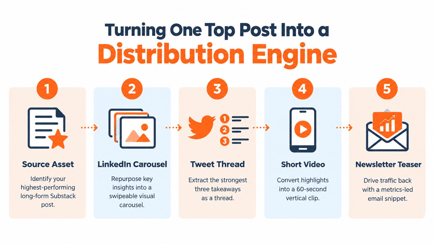
Turning One Top Post Into a Distribution Engine
Most repurposing fails because people choose the wrong source asset. They pick the newest post, the one they personally like most, or the one that got a quick social spike. None of those is enough.
I look for the post that kept working after publish week. The winner usually has sustained attention, strong depth signals, and at least some evidence that it influenced subscriber or lead movement.
What makes a source asset worth repurposing
I score candidates on three dimensions:
- Traffic durability: Did the piece keep attracting visits beyond the initial spike?
- Engagement depth: Did readers stay, scroll, or reply?
- Conversion assistance: Did the piece show up before signups, inquiries, or other meaningful actions?
If a post peaked early because one channel pushed it and then it died, I usually leave it alone. If it kept earning attention from multiple sources, that's a stronger repurposing candidate.
A practical remix path
One long-form Substack article can turn into:
- A LinkedIn carousel built from the strongest argument or framework
- An X thread using the three sharpest takeaways
- A Medium excerpt that points readers back to the full source
- A short video script built around the hook and one proof point
- A Substack Note that reopens the conversation with one angle from the piece
Here's the important part. Each version should do a different job. Don't paste the same copy everywhere.
A workflow tool can help if you're publishing across several networks. Narrareach is one option that lets writers schedule Substack Notes, Medium articles, LinkedIn posts, and X content from one place while repurposing a strong source asset into platform-specific formats. If you're building that process manually, a documented content repurposing workflow keeps the system from turning into copy-paste chaos.
For a quick walkthrough of the logic behind remixing a source asset, this video is worth a look.
Protect the source while you distribute
A few rules keep repurposing from creating new problems:
- Change the format natively: Carousels should read like carousels. Threads should read like threads.
- Control link architecture: Let some posts earn engagement natively. Use links where intent is strongest.
- Keep the original asset central: Distribution should feed the source article, not cannibalize it.
- Schedule with intent: Publish where your audience already responds, then watch assisted effects, not only direct clicks.
Users usually grow faster. Not because they publish more, but because one proven idea gets stretched across channels efficiently instead of being replaced by five untested ones.
A Weekly Workflow That Connects Metrics to Action
The cleanest system I've used takes about 90 minutes a week. Not a full analytics day. Not a dashboard binge. Just a tight loop that produces decisions.
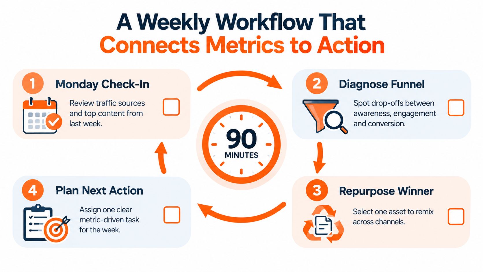
Monday review
Open three views and nothing else:
- GA4 acquisition: Which sources brought readers to owned assets
- Substack subscriber delta: Which posts were followed by movement in subscribers
- UTM-tagged landing pages: Which channels produced meaningful actions
Then make one decision per metric layer.
- Awareness decision: amplify, hold, or stop distribution
- Engagement decision: revise structure, headline, or format
- Conversion decision: fix CTA path or double down
- Retention decision: update, re-share, or add to nurture flow
Wednesday planning
Midweek, I pick one winner from the prior week and turn it into the next distribution set. No brainstorming marathon. No blank-page ritual.
Use the strongest source asset and map it into the channels where it fits naturally. If you write on Substack, this is also the point where scheduling Notes and downstream social posts matters. Efficient operators don't wait until each platform needs something. They schedule and publish in batches.
A documented content creation workflow helps if your process keeps breaking between draft, publish, repurpose, and review.
Friday distribution push
Friday is for shipping the remixed assets. I format for each channel, keep the hook specific, and watch early reaction without overreacting to it.
Working rule: Every week should produce at least one kill, one iterate, or one amplify decision.
That rhythm matters because content is increasingly judged by action, not output. Content marketing has been reported to cost 62% less than traditional marketing while generating about 3 times as many leads, and B2B marketers have ranked sales lead quality at 87%, sales at 84%, and high conversion rates at 82% as key success indicators in Content Marketing Institute's statistics roundup. If that's the standard, your weekly workflow can't stop at publishing. It has to connect content to qualified outcomes.
Vanity Versus Revenue and Why the Debate Is Overrated
People love arguing about vanity metrics as if pageviews and revenue live on opposite sides of a moral line. They don't. Context decides whether a number is useful.
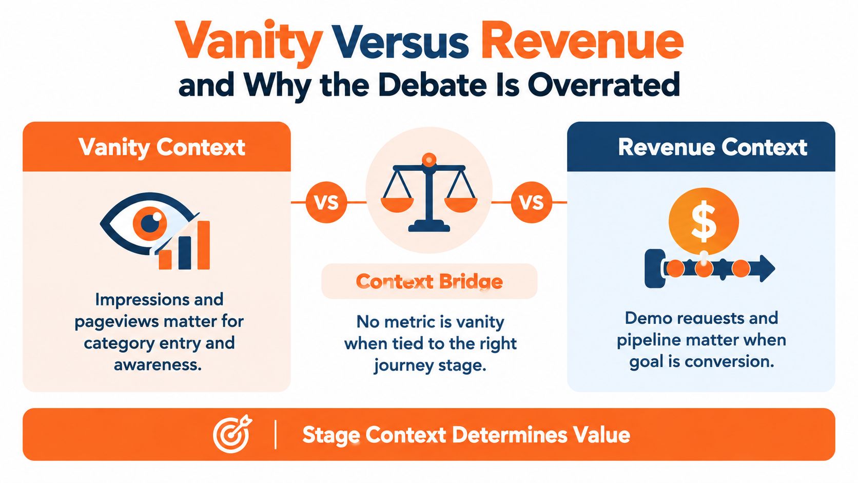
A high-visibility post can deserve budget even when direct conversions are weak. If the job was category entry, search demand creation, or audience capture, awareness metrics matter. On the other hand, a low-traffic comparison page can punch far above its weight if it pulls in high-intent readers and converts.
The better question
Don't ask whether a metric is vanity or revenue. Ask what decision it earns.
- Followers can matter if they expand future distribution.
- Pageviews can matter if they validate topic demand.
- Form fills can matter if lead quality holds up.
- Assists can matter if they keep appearing before real action.
What fails is using any one of those outside its stage context.
The traps
Three habits create bad reporting fast:
- Treating followers as a proxy for revenue
- Treating form fills as the only sign of intent
- Treating large top-line numbers as proof of business impact
A metric keeps its place on the dashboard only if it helps you decide what to do next week. If it doesn't, cut it.
Your Reporting Rhythm and What to Do Next
A sustainable reporting cadence is simpler than many assume. Daily, I want a fast check for anomalies. Weekly, I want a review that changes next week's publishing plan. Monthly, I want an audit that cuts dead weight.
The rhythm that survives handoffs
Use three reporting intervals:
- Daily five-minute check: traffic spikes, comment volume, obvious failures
- Monday thirty-minute review: top three assets by stage-relevant metric
- Monthly ninety-minute audit: funnel drift, attribution gaps, and the content kill list
Each interval should produce an artifact someone else can read without asking what happened.
- Daily artifact: short note on anomalies
- Weekly artifact: one-page decision memo
- Monthly artifact: updated scorecard and archive of killed, revised, and amplified assets
If you're still building the foundation, make yourself a checklist. Which awareness metrics matter? Which engagement number predicts repurposing value? Which conversion metric belongs to which asset type? That's enough to improve the system quickly.
If you're further along, the next move is operational. Find the one source asset that deserves wider distribution. Then build a repeatable path to schedule and publish its derivatives across Substack, Medium, LinkedIn, and X without rebuilding the post from scratch every time.
If you want help turning this into a working publishing system, Narrareach helps writers spot what content is already working, repurpose it into Substack Notes, Medium pieces, LinkedIn posts, and X content, then schedule and track it from one place. If you're ready to operationalize cross-platform distribution, start there. If you're still tightening your measurement foundation, keep reading and build your dashboard around decisions first.