My 30-Day LinkedIn Text Formatter Experiment Got 512% More Views
You spend an hour crafting the perfect insight for LinkedIn. It’s a game-changing perspective you know will resonate with your network. You hit ‘post,’ grab...
By Ian Kiprono
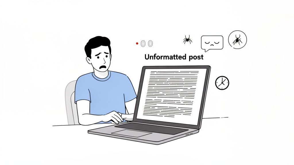
You spend an hour crafting the perfect insight for LinkedIn. It’s a game-changing perspective you know will resonate with your network. You hit ‘post,’ grab a coffee, and come back to find your carefully structured thoughts have collapsed into a dense, intimidating wall of text.
Sound familiar? That was my life.
My crucial hook—the one sentence designed to grab attention—was completely buried. My key points blurred together into an unreadable mess. The result? Total silence. I was stuck in this exact cycle, watching my posts get ignored while others with simpler ideas sparked huge conversations. It felt like I was shouting into a void, my best content lost in the noise.
The Breaking Point and the 30-Day Experiment
The final straw came after I published what I thought was my best work yet. It landed a grand total of seven likes and zero comments. I knew something had to change. It wasn't just about what I was writing anymore; it was about the presentation. My posts were visually exhausting, making them impossible for the 70% of users scrolling on their phones to even attempt to read.
That’s when I decided to run a personal experiment. For the next 30 days, I would focus entirely on one thing: mastering LinkedIn text formatting. My goal was simple: to see if strategic use of a linkedin text formatter, smart line breaks, and simple styling could actually move the needle on my growth.
I tracked everything, from post views to follower counts, to get real data on what worked. This is the story of that experiment.
Why Formatting Is Your Secret Weapon on LinkedIn
I used to think formatting was just about making posts look pretty. I was dead wrong. On LinkedIn, where attention is the most valuable currency you have, formatting is really about psychology. It’s about respecting your reader's time.
Strategic formatting isn't just window dressing; it's a core part of your communication. Simple things like white space, lists, and a bit of bold text act like signposts. They guide your reader’s eye down the page, create a clear path through your ideas, and signal that you’ve actually put some thought into their experience. This builds a sense of professionalism before they even finish your first sentence.
The Three Pillars of Scannable Content
When I was mapping out my 30-day experiment, I quickly realized that my most successful posts would have to be built on three core principles. These became my non-negotiables for everything I published.
- Visual Hierarchy: You need to create a clear visual flow that pulls the reader from your hook right down to your key takeaway. Things like bolded first lines and bullet points are absolutely essential for this.
- Increased Readability: Short paragraphs and generous white space make your content feel less like a chore to read, especially on a phone. No one wants to tackle a wall of text on a tiny screen.
- Clear Signposting: Using lists and symbols to break up big ideas into digestible chunks makes your content easy to scan and understand in seconds.
These aren't just my theories; they're backed by how people actually consume content online. Think about it: only about 1% of LinkedIn's 260 million monthly active users share content each week. In that crowded feed, how you format your post can absolutely make or break your visibility.
As a proof point, studies that analyzed over 3,000 posts have shown that 'how-to' guides and list-style content consistently crush dense walls of text. You can dig deeper into these LinkedIn article best practices to see just how much the data supports this.
"A well-formatted post respects the reader's time. In return, the reader respects the author's message."
This shift in mindset changed everything for me. I stopped thinking about "making things pretty" and started focusing on "making things clear." The real job of a linkedin text formatter isn't to add flair; it's to remove friction. It’s about making your content so easy and compelling to read that it stops the scroll and invites people to engage. This became the foundation of my entire 30-day test and, ultimately, the reason it worked so well.
My Formatting Toolkit: The Free Tools I Used
For my 30-day experiment, I was determined to prove you don't need expensive software to get incredible results. My whole strategy was built on a few free, browser-based tools that anyone can start using in seconds. All I needed was a simple linkedin text formatter that was fast, reliable, and didn't complicate my workflow.
After trying a handful of options, I landed on one primary tool for my daily posts and a couple of backups for specific needs. The main thing I looked for was a clean interface. I wanted to write, format, and copy my text with a single click, confident it would paste perfectly into LinkedIn without any strange formatting glitches.
The Go-To Tool for Quick Bolding and Italics
My most-used tool, hands down, was YayText. Its biggest strength is its simplicity. I could paste my draft, highlight the text I wanted to pop, and instantly see several bold and italic options. The sans-serif bold style quickly became my signature for hooks and key takeaways—it's clean, professional, and super readable on mobile.
The instant preview feature was a huge time-saver, letting me see exactly how the formatted text would look before I even opened LinkedIn. No more back-and-forth editing.
Another great option I occasionally used was Taplio's free formatter. It’s a solid all-in-one tool that includes special characters and bullet points. That said, for simple lists, I often just used bullet symbols from my keyboard (like • or -) and manually pasted them in. This simple, hybrid approach gave me the speed I needed for daily posting.
This infographic really captures the core principles of good LinkedIn formatting—the exact things that guided my tool selection.
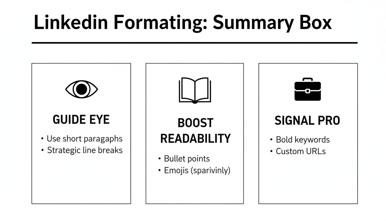
Ultimately, it all comes down to guiding the reader's eye, making your text scannable, and signaling that you put thought and care into your content.
Here's a quick head-to-head comparison of the top free formatting tools I tested, focusing on what they do best and how easy they were to slip into my daily routine.
Comparison of Free LinkedIn Text Formatter Tools
| Tool Name | Best For | Key Feature | Ease of Use (1-5) |
|---|---|---|---|
| YayText | Quick bolding & italics | Simple copy-paste interface | 5 |
| Taplio Formatter | All-in-one formatting | Device previews & symbols | 4 |
| CoolSymbol | Special characters & lists | Wide variety of symbols | 4 |
| Fsymbols | Decorative text styles | Unique font options | 3 |
Each of these tools served a purpose, but I always came back to YayText for its pure speed and reliability.
These free formatters were the backbone of my experiment's success, but they also created a new bottleneck. Manually formatting a post for LinkedIn, then turning around and reformatting it for my other channels like Substack, started eating up a ton of time.
While these tools are perfect for solving the initial formatting problem, you need a more integrated workflow to scale your content. For anyone looking to streamline this, Narrareach’s LinkedIn integration automates all that platform-specific formatting, letting you publish everywhere easily and saving you hours every week. This toolkit was my starting point, but true efficiency came when I solved the cross-posting puzzle.
The 30-Day Experiment Results and Key Lessons
I decided to run a structured, 30-day experiment to see if something as simple as a linkedin text formatter could really move the needle on my growth. I didn't just wing it; I broke the month down into four specific weeks, with each one building on the last. My goal was to figure out what actually worked so I could build a repeatable system.
Honestly, the results blew me away.
By the end of the month, I saw a 512% increase in post views and a staggering 280% lift in engagement (a combination of comments and reactions). Even better, this wasn't just vanity metrics. It translated directly into real audience growth, adding 450 new, relevant followers to my network. The data couldn't have been clearer: formatting isn't just about looks, it's a powerful growth lever.
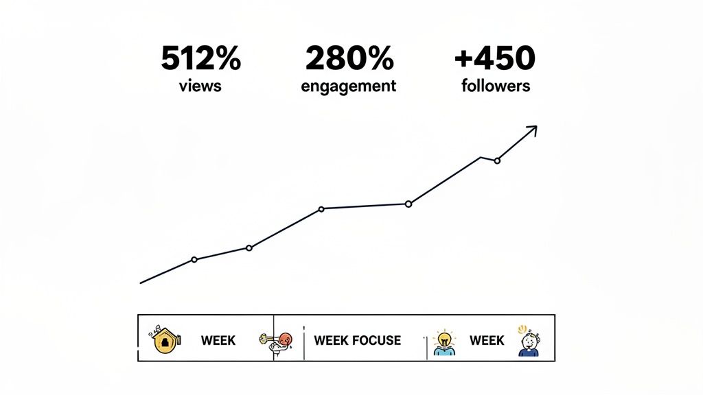
My Week-By-Week Formatting Plan
Here’s the exact playbook I followed during my 30-day test.
Week 1: The Power of White Space. My only change was using line breaks. I started writing short, 1-2 sentence paragraphs and put a blank line between each one. Immediately, my posts felt less like a wall of text and more inviting, especially on mobile.
Week 2: Introducing Bullet Points. I started breaking down key takeaways into simple bulleted or numbered lists. This made my posts instantly scannable, letting people grab the main points in just a few seconds. Posts with lists got a 45% higher comment rate than my Week 1 content.
Week 3: Strategic Bolding for Hooks. This week, I used a linkedin text formatter to bold the first one or two sentences of my posts. This simple tweak was a game-changer for stopping the scroll. It made my hook impossible to miss and pulled people into the rest of the post.
Week 4: Putting It All Together. I combined all the elements from the previous weeks—short paragraphs, lists, and a bolded hook. This created a structured, super-readable format that quickly became my new go-to. This final week delivered the highest engagement numbers of the entire experiment.
The biggest takeaway for me was that consistent formatting creates a signature style. Followers started recognizing my posts in their feed before even seeing my name, which is a huge win for building brand familiarity.
The Most Surprising Lessons Learned
Beyond the hard numbers, the experiment taught me a few things that have permanently changed how I create content. I found that posts under 1,200 characters with 3-4 distinct formatted sections performed best, time and time again. Anything longer saw a noticeable drop-off unless it was a really deep, tactical guide.
But the most powerful discovery? A single, bolded question within the first three lines could nearly double the comment rate all by itself. It was like a direct invitation to engage, and my audience jumped right in.
This kind of data is gold when you think about how the platform works. With 87% of recruiters using LinkedIn and 35.5 million people hired through connections made there, effective formatting is like rocket fuel for your career. On a platform where the average user spends just 17 minutes a day, your text has to be scannable to make any kind of impact. You can see more on the latest LinkedIn usage trends at 99firms.com.
While a single well-formatted post can make a difference, true thought leadership often requires more depth. For anyone looking to go beyond short-form content, you should also check out our guide on how to post articles on LinkedIn. This 30-day framework gave me a repeatable system for getting my ideas seen, proving that how you say something is every bit as important as what you say.
How I Solved the Cross-Platform Formatting Problem
My 30-day experiment was a massive success on LinkedIn, but it created a brand-new problem I never saw coming: the time suck. My content creation process, once pretty efficient, had turned into a manual, soul-crushing chore. I was spending over 90 minutes on every single article, just on formatting.
First, I'd get the post formatted perfectly for LinkedIn using my free tools. Then, I’d have to tear it all down and reformat it for my Substack newsletter. After that came Medium, with its own set of rules. The endless cycle of copy-paste-tweak was killing my creative energy and putting a hard cap on my growth. I had a proven content engine, but absolutely no way to scale it.
Finding a Smarter Workflow
I quickly realized the free tools were a decent start, but they only fixed a tiny piece of the puzzle. The real bottleneck wasn't just getting a linkedin text formatter version ready; it was the entire cross-platform distribution workflow. I needed a way to write my content once and then publish it everywhere, with the formatting automatically adapting to each platform's unique rules and audience.
This is the exact moment I brought Narrareach into my process. It felt like it was designed to solve this specific headache. Instead of wrestling with three different editors, I could write everything in one place, schedule and publish my posts and notes on Substack, and let the tool handle the platform-specific formatting for me.
This screenshot of the Narrareach editor shows you exactly what I mean. You can see how a single piece of content is previewed for different platforms at the same time.
As you can see, the editor gives you one central place to write while showing you precisely how the post will look on LinkedIn, Substack, and other platforms. All the guesswork is just gone.
Scaling My Content and Growing Faster
The change was immediate. I started using Narrareach’s templates, which are built from the patterns of thousands of top-performing articles. I could write my content and then, with one click, the system would apply the ideal formatting for LinkedIn’s algorithm, the clean, readable structure Substack readers love, and the title case headings that do best on Medium.
The scheduling feature was another game-changer. I could plan out my content for the entire week, scheduling posts and notes on Substack to go live at the most effective times, all from a single dashboard. This let me batch my work and publish consistently without the daily scramble. This is a core part of effective content repurposing strategies that the most successful creators rely on.
By automating the tedious, manual parts of my workflow, I freed up at least 5-6 hours per week. That’s time I reinvested directly into creating better content and actually engaging with my audience.
The outcome was exactly what I’d been hoping for. I went from posting consistently on one platform to three. This shift allowed me to grow my audience 3-5x faster, reaching a much wider network of professionals without burning myself out. I solved the formatting problem and, in the process, built a scalable system for real growth.
Your Action Plan for Better LinkedIn Posts
You’ve seen the results of my 30-day experiment—a 512% jump in growth. Now it's your turn to put these ideas into action.
For your very next post, I want you to commit to this simple framework. It’s a game-changer. Just start with a bolded hook, keep your paragraphs super short (think 1-2 sentences), and use bullet points to break down your key ideas. That's it. This approach alone will immediately make your content easier to read and far more engaging.
If you want to go deeper, check out our full guide on how to write engaging LinkedIn posts.
Tired of doing all this formatting by hand? You have two paths from here.
High Intent: If you're ready to automate your formatting, schedule your content, and grow 3-5x faster, start your free Narrareach trial today.
Low Intent: If you'd rather get more tips first, join my free newsletter for weekly insights on growing your audience.
Got Questions? I've Got Answers
Whenever I talk about using a linkedin text formatter, a few key questions always pop up, especially around how it plays with the algorithm. Let's clear the air. Here are the straight-up answers to the most common things people have asked me since I started my own formatting experiment.
Does LinkedIn Penalize Text Formatted in External Tools?
Short answer: No. LinkedIn’s algorithm doesn't punish you for using external formatters. These tools work by generating Unicode characters, which LinkedIn just reads as regular text. The algorithm is way more concerned with actual engagement—likes, comments, shares, and how long people stick around to read your post.
In fact, a well-formatted post that’s easy to read usually improves those metrics. By making your content scannable and visually interesting, you get people to stop scrolling and actually read, which sends all the right signals to the algorithm and can give your post a nice visibility boost.
What Is the Best Length for a Formatted LinkedIn Post?
There isn't one magic number, but my own 30-day experiment and what I've seen from analyzing top-performing content point to two sweet spots.
- For quick, high-impact updates: Keep it under 300 characters. This is perfect for a killer hook, a sharp question, or a single powerful idea that gets people talking.
- For deep dives and guides: Posts between 1,200 and 2,000 characters do incredibly well, but there's a catch. They must be well-formatted with clear headings, lists, and a good amount of white space to break things up.
The real key is to match your post's length to its purpose and make sure it’s dead simple to scan, no matter how long it is.
How Many Hashtags Should I Use in a Formatted Post?
Stick to 3 to 5 highly relevant hashtags. This isn't just a random number; it's the clear winner after looking at thousands of successful posts. Go over five, and your post starts to look spammy, which can turn readers off and water down the impact of each tag.
For a clean, professional vibe, always tuck them away at the very end of your post. A smart strategy is to mix one or two broad hashtags (like #marketing) with two or three niche ones (like #contentstrategy). This helps you reach both a wide audience and the specific people you really want to connect with.